
In today’s digital era, having a mobile-responsive website is essential for any business, especially in the fashion industry. With the increasing use of mobile devices for online shopping, it is crucial to provide a seamless browsing experience for your customers. In this article, we will explore the importance of mobile-responsive fashion website templates and showcase some of the best options available to help you create an optimized mobile browsing experience for your fashion brand.
The Importance of Mobile-Responsive Websites in the Fashion Industry
- Growing Mobile User Base: Mobile devices have become the primary tool for browsing the internet. According to Statista, mobile accounted for over half of all website traffic worldwide. In the fashion industry, where visuals play a significant role, it is crucial to provide a seamless mobile browsing experience to capture the attention of potential customers.
- Enhanced User Experience: A mobile-responsive website ensures that the layout, images, and features are optimized for small screens. This allows users to navigate through product pages, view high-quality images, and make purchases without any inconvenience. A seamless browsing experience boosts customer satisfaction and encourages repeat visits.
- Increased Conversion Rates: Studies have shown that mobile-responsive websites have higher conversion rates compared to non-responsive ones. When customers can easily browse and make purchases on their mobile devices, they are more likely to complete transactions. A mobile-responsive fashion website can significantly impact your sales and revenue.
- Improved Search Engine Rankings: Mobile responsiveness is a crucial factor in search engine optimization (SEO). Search engines prioritize mobile-friendly websites, meaning that a non-responsive site may be ranked lower in search results. By implementing a mobile-responsive template, you can improve your website’s visibility and attract more organic traffic from mobile searches.
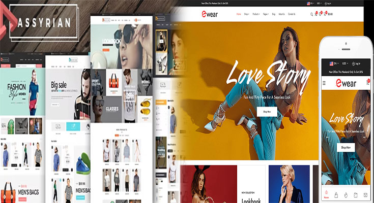
Best Mobile-Responsive Fashion Website Templates
Here are some outstanding mobile-responsive fashion website templates to consider for your online store:
- Shopify: Shopify offers a wide range of responsive templates designed specifically for fashion brands. With customizable designs, mobile-friendly layouts, and seamless integration with popular payment gateways, Shopify allows you to create a professional online store that works flawlessly across all devices.
- Wix: Wix provides numerous mobile-responsive templates, including fashion-focused options with stylish designs. The drag-and-drop editor makes it easy to customize your site and ensure a smooth browsing experience on mobile devices. Wix also offers features like built-in SEO tools and a mobile editor to further optimize your website for mobile users.
- Squarespace: Squarespace offers visually appealing and mobile-optimized templates suitable for fashion websites. With its intuitive interface and responsive design, Squarespace allows you to create an elegant and seamless browsing experience on mobile. The platform also offers e-commerce functionality, making it convenient to set up an online store.
- WordPress: WordPress provides numerous mobile-responsive fashion website themes, both free and premium. With its flexibility and wide range of plugins, you can easily create a mobile-friendly website that suits your brand’s style and functionality requirements. WordPress also offers various e-commerce plugins to enhance your online store’s performance.
Key Elements of a Mobile-Responsive Fashion Website
While selecting a mobile-responsive fashion website template is crucial, it’s equally important to incorporate certain features and design elements to optimize the browsing experience. Here are some key elements:
- Simple Navigation: Implement user-friendly navigation menus and make sure they are easily accessible on mobile devices. Consider using dropdown menus or a hamburger menu to save screen space and enhance usability.
- High-Quality Visuals: Use high-resolution images that load quickly on mobile devices. Compressing images without compromising quality can ensure faster loading times. Also, consider displaying product images in a slide show or carousel format to maximize visual impact.
- Mobile-Optimized Product Listings: Ensure that galleries or grids showcasing product listings are formatted for mobile screens. Use clear call-to-action buttons and make it easy for users to filter and sort products.
- Responsive Checkout Process: Streamline the checkout process by minimizing the number of steps required. Implement an optimized mobile checkout page, including guest checkout options, auto-fill fields, and multiple payment methods.
- Fast Loading Speed: Optimize your website’s loading speed to minimize bounce rates. Compress images and eliminate unnecessary elements that may slow down the mobile browsing experience.
A mobile-responsive fashion website is crucial for engaging, converting, and retaining customers in the digital age. By selecting and customizing a mobile-responsive website template, you can create a seamless and visually appealing browsing experience for your fashion brand. Consider the templates and key elements mentioned above, and invest in a mobile-responsive website to provide your customers with an exceptional online shopping experience, leading to increased conversions and business growth.